На этой странице описывается модификация игры. Изменение внутренних настроек искажает оригинальный ход игры, а в некоторых случаях приводит к её неработоспособности. Используйте на свой страх и риск.
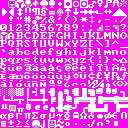
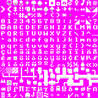
Набор символов, или просто тайлсет, представляет собой изображение в формате BMP или PNG, содержащее 256 различных тайлов, соответствующих кодовую таблицу IBM 437 (иногда называемую расширенным ASCII). Они используются для отображения большей части графики в ASCII-режиме игры и текстовых элементов в графической версии. Эта страница служит репозиторием тайлсетов, созданных сообществом, и включает инструкции по их установке.
Тайлсеты по умолчанию (640×300 и 800×600) отображают символы 8×12 и 10×12 соответственно, с большими латинскими буквами, занимающими область 7×9, и выглядят в целом похожими на шрифт IBM MDA, если судить по "0", "g" и "f" (но с небольшими отличиями, включая "0", "W" и "y"). Точное происхождение шрифта, взятого для игры, неизвестно.
Установка
В текущей версии (как минимум на момент 53.10) использование некоторых тайлсетов может привести к тому, что нижний и правый края экрана не будут реагировать на мышь.Bug:13462 Это зависит от размера; 8×12 и 10×12 подходят, а 16×16 — нет. Этого можно избежать, развернув окно или настроив игру в полноэкранный режим.
Другие проблемы, которые могут возникнуть при использовании иного тайлсета:
В графической версии рамка мини-карты будет масштабироваться в соответствии с тайлсетом, но изображение мини-карты — нет.
В графической версии использование тайлсета с другим соотношением сторон приведет к растягиванию элементов интерфейса.
В графической версии некоторые элементы интерфейса не масштабируются по размеру тайлсета.
В любом режиме и даже со стандартным тайлсетом в некоторых масштабах и размерах игрового дисплея в меню может не хватить места для отображения всех элементов; особенно меню знати.
Чтобы использовать определенный тайлсет с Dwarf Fortress, вы должны выполнить следующие шаги:
Скачайте тайлсет. Каждый тайлсет представляет собой просто изображение, поэтому отдельной ссылки для скачивания нет. (Щелкните левой кнопкой мыши на изображении тайлсета, затем правой и Сохранить как.)
При необходимости конвертируйте тайлсет в правильный формат изображения для используемой вами версии игры:
Для DF 0.28.181.40d или старше: откройте файл в графическом редакторе и сохраните его как BMP, если он еще не в этом формате.
Для DF 0.31.01 или новее: откройте файл в графическом редакторе и сохраните его как PNG с прозрачностью если это еще не в этом формате.
Не меняйте расширение на .bmp или .png; нужно использовать графический редактор, вроде MS Paint и сохранить картинку правильно.
Переместите/скопируйте файл в папку игры с именем art (.../data/art), расположение которой зависит от настроек портативного режима.
Отредактируйте файл data/init/init_default.txt, чтобы указать используемый файл тайлсета. Есть три места, которые можно изменить:
Укажите тайлсет для оконного отображения, задав имя файла в теге [FONT:<имя файла>].
Укажите тайлсет для полноэкранного отображения, задав имя файла в теге [FULLFONT:<имя файла>].
Укажите тайлсет для экрана загрузки и меню, задав имя файла в теге [BASIC_FONT:<имя файла>].
Все три могут ссылаться на один файл. Установка их в разные файлы может дать непредсказуемые результаты.
После внесения изменений не забудьте сохранить файл.
Некоторые тайлсеты требуют изменений в raw-файлах, что обычно указано отдельно. Что это за изменения, будет зависеть от самого тайлсета, и могут быть действительны только для более старых версий. Аналогично, некоторые тайлсеты могут предполагать изменения в d_init.txt, например [PILLAR_TILE:255], хотя такой опции больше не существует.
После сохранения файла и внесения необходимых изменений можно приступать к игре с новым тайлсетом! Игра не сохраняет эти параметры FONT-теги в prefs/init.txt, поэтому их добавление туда будет только временным.
Квадратные тайлсеты
1×1
Название
[[#{{{filename}}}|{{{filename}}}]]
Автор
Loud Whispers
Создан
2015-03-30
Размер тайлов
1×1
Разрешение
80×25
Версии
Комментарий
So on suggestion I made the new version of Monoscii which has every tile be 1 pixel, the entire map nearly fits into the screen just fine. Monoscii Lite is superior in every way, the information is denser, crisper and cleaner. pUrists will finally be one step closer to the most pUrist DF possible. (forum post link)
A large 257x257 DFMA world gen map can be found here.Updated 08/06/08. Changed most text characters as well as some others to 4x4 with blackspace to avoid tiling. Most characters have been revised to be spaced out to be more distinguishable in such a small set. After seeing the dev update earlier today about increasing your view size I decided to create this small font. This has been built completely from scratch, mostly while at work today. I may be making a shaded version in the future. The first image to the right is from the Abbeyverse succession game.
Version 2.05. Updated 11/12/07 to de-fuzz uppercase letters, added serifs and clarified lowercase letters, made horizontal spacing consistent throughout character set, fixed one error in the double horizontal-left-right, single-vertical-up-down character, made exclamation points consistent, thinned out question mark and inverse question mark, sharpened sideways stemless arrows, clarified international characters, and clarified some Greek letters. Since v2.0: fixed 'i' 'g', fixed Yen symbol, fixed smiley 0x01 to not have an extra line to its right, lowered the period and colon characters, fixed position of 'x'. Thanks to Markavian for ideas on how to improve the font, as well as an occasional character glyph.
Based on the original IBM CGA Character set with a lot of tweaks. The characters remain as descriptive yet universal as possible. I chose the CGA set because it is in my opinion the square set with the best readability. This set is for those who like the basic ASCII look where every pixel has meaning or (multiple meanings). Download the BMP
There is also an upscaled 16x16 version of this set available for fullscreen use below.
Modified version of the Anikki 8x8 tileset. Just prettifies it a bit; some characters are tweaked to make them work slightly better for one of their jobs without disturbing the rest. Others are redesigned entirely. Most importantly, dwarves were given beards.
The original IBM CGA Character set, thick variant, dumped from addresses 0x1800-0x1fff the 5788005 IBM Character Generator ROM. This is the far more common 'thick' variant. Best viewed at 8:5 aspect ratio.
The original IBM CGA Character set, thin variant, dumped from addresses 0x1000-0x17ff the 5788005 IBM Character Generator ROM. This is the less common 'thin' variant, which required soldering on two pins and jumpering them on the CGA card to use. Best viewed at 8:5 aspect ratio.
The IBM EGA 8×8 Character set, dumped from the 6277356 IBM EGA BIOS ROM. This is ALMOST 100% IDENTICAL to the CGA thick font, but has minor modifications (23 pixels total) done to four characters: the capital 'S', the club sign, the spade sign, and the large asterisk (the one with a hole in the middle, char 0x0f, not the shift-8 one which is char 0x2a). There is no thin variant of this font. Best viewed at 8:5 aspect ratio.
Meant to resemble the vanilla curses tileset, which itself is similar to Microsoft's 8x12 Terminal font. Glyphs sourced from various bitmap fonts and/or modified by hand.
A mishmash of the CGA, Acorn and C64 character fonts (and just a hint of Fixedsys), with a few pixels nudged here and there and several symbols shifted to make world maps look nicer.
I like packing as much on the screen as I can, but 8×8 is just too crowded for 1920×1080 fullscreen. I intended to make a 10×10 version of Pastiche, but I had to make countless little changes to maintain visual consistency between the two sizes. I finally gave up, called it a new font, and changed some more stuff just because! Like Pastiche, Potash is a pure ASCII/CP437 font, suitable for use outside of Dwarf Fortress should you happen to find yourself stuck in 1985.
This is the tileset used by Acorn computers, starting with the BBC Micro. This version is as it would have appeared in 40-column modes (and shuffled a little to adapt it to CP437). It also looks nice at double resolution. Download the BMP.
Name: Yayo's C64; Based on the charset of the Commodore 64. It's a flat style, but it's clean and also highly readable. I recreated all the missing chars like letters with accents and symbols, trying to get a c64 style as much as possible. If it's too small, use the 16×16 version below. :)
Another square tileset that's usable on low resolutions, modelled after a common font used on the Nintendo Entertainment System. I also made a 18x18 version to fit my 1440x900 screen, back when the aspect ratio of DF was locked. If you like your set a bit more graphical, check out Teeto_K's version.
There is no doubt that this tileset is old. This must be distinctly understood if anything wonderful is to come of your use of it. You may like Dorten's revision more. The following is the original description: I dislike curses_640x300.bmp due to its lack of any kind of graphics for things like a bed or a barrel and the fact that it distorts my beautiful circles, so I made a similarish tileset to fix those.
Based primarily on Tocky and Plac1d's sets (which are brilliant). The characters remain as descriptive as possible with some tweaks to the font for better readability and some changes to symbols for more consistency. This set is for those who like the basic ASCII look where every pixel has meaning or (multiple meanings). Download the BMP
I wanted every character in this set to be the very best text symbol it could possibly be, while still looking good in-game.
A hidden feature of this tileset is that the border around the white tile only has its red color-component changed, which means that a nice clear grid shows up over (brown) designations, while (blue) ice walls still look perfectly smooth.
Based on Anikki, with some simplifications and modifications. I like Markavian's walls, so I did something similar. The bottom right tile, number 255, I use for pillars. You can set that in your d_init.txt, the line should look like [PILLAR_TILE:255]
800×250 for 80×25 grid size, others just multiply grid by 10.
Версии
Комментарий
Custom tileset I made for my own use when the adjustable grid sizes were released for DF. Some accented letters cut slightly to allow for larger letter display. Contains several of Tocky's tiles (barrels, some trees, dimple cups, coins, slightly modified armor stand). Others are either made by me or adjusted from curses_800x600 tiles.
The "full size" version of Potash. I insist on using a square font to maintain sanity when judging sizes and distances, but I'm not a fan of how text usually looks with square glyphs -- the letters are either too wide, or spaced too far apart. I've tried balance those two flaws against each other as much as possible, and I think this font is very readable as a result. Nearly all the 10×10 glyphs have empty borders on all four sides, to prevent confusing (or just ugly) connections between adjacent tiles.
A sharp looking, vanilla styled tileset that strives to strike a good balance between nice, attractive graphics, while avoiding graphical oddities. I find the cumulative differences from the ASCII add to the game. Feel free to leave me a note. This has turned into a [1], and includes alternate walls, fonts, and racial graphics.
I tried to make all the pictographic symbols as descriptive as possible: the only ones I've spotted that show up in odd places are the staircase symbols, '<' and '>', which are used as tags on barrel descriptions, and don't match -- but I'm willing to live with that in order to be able to tell up-stairs from down-ones. With everything else, I just tried to maximize clarity and readability and to keep them consistent. I'm really very pleased with how this set turned out.
This works great on my EeePCs shoddy resolution of 1024x600, and this is why I made it. This is basically the Terminus font converted for use on DF. I chose this font due to its readability at a low resolutions, and soon I'll convert some of the non-letter characters into actually objects like beds and dwarves, so keep a look out for an updated version that I'll add below.
This forum thread has the slightly 'graphical' test version. Quite amusing. Check there for updates.
Much like Hanuman's conversion, this is based on the default curses_640x300 tileset, converted to 12x12. There are no significant modifications to the tiles, smoothing, etc - just some cosmetic changes mostly to take advantage of 4 extra horizontal pixels. For people who like the original tileset's look and size but want a square version of it.
Similar to Alloy's conversion, this is based on the default curses_800x600 tileset, converted to 12x12. I wrote a GIMP python plugin to add padding to bring each tile up to the required size, and then I manually tidied up the places where the images no longer went all the way to the edge of the tile. This ensures that the positioning of each image within each tile stays exactly the same as in the original tileset, but with a single pixel column added on both sides of the tile to bring it up to size. For people who like the 800x600 original tileset's look and size but want a square version of it.
I wanted a 12x12 ASCII graphics set, sharp, with pleasant text, so I wound up making one myself from scratch. It's a little influenced by Guybrush, which I love, but after awhile the blurriness got to me.
(This tileset is not entirely ASCII; I changed the equals sign to a pattern, so that stockpiles would look the way I like.)
This revision is designed to work with DF version 0.27.169.33a with special tiles for stairs and ramps, as well as the changes present in the earlier version such as bones, walls, trees and swords. Available in mkv curses 12×12 and 6x6 v2.zip. As seen in the fortress of Axegear.
An older revision of my square tileset, featuring more detailed symbols, with alterations to certain text characters to look more like ingame items. The walls are infilled now.
This is very similar to the above tileset, but has some noticeable differences. I have no idea where I got it from. It's great on a 1024x768 CRT monitor in windowed mode. I use it in a 1000x500 window with [BLACKSPACE:YES]. --JT
A fresh spin on Vidumec's "nice curses" tileset - includes a couple different graphics that both keep the ASCII feel and provide better visual representations while preventing text artefacts, including new graphics for sheets, plus a Moai statue since making the statue specifically humanoid didn't feel generalisable enough. A 24x24 version is available.
I wanted a tileset smaller than 15x15 that would still display nicely on a netbook (e.g. 1366×768), but still be clearly legible. I think I have succeeded in that goal. On a 1680×1050 display the resolution is 129×80 with this tileset.
Name: Yayo's Tunur; According to the language files of DF, Tunur means "style" in dwarf language. It may require a bit to get used to some symbols, but it's a very clean tileset. (It's just a bit weird. :P)
I find the text hard to read in most other tilesets, so I made a new one. Mostly ASCII with a few graphical nods. Lower right char is for PILLAR:255 in df_init.
Built from scratch, this ASCII tileset is made with two common 16:10 resolutions in mind. The odd tile size fills the above resolutions without artifacts and it gives an advantage in design, making for sharp features and equal spacing between characters. The manual anti-aliasing gives the set a nice and clean look. Transparent PNG support is needed for this one.
1440×900 (96×60 grid size) 1680×1050 (112×70 grid size) Actually looks good on any resolution
Версии
Комментарий
I liked the great Talryth square 15x15 very much! However dwarves tiles were a litlle bit out of the style, so I changed them to default-like ones. Also added background so the there is no more black background which with bright ASCII was hard to my eyes. Again thanks to Talryth for his amazing job!
Tileset intended to build upon Sphr's and Jackard's work, as well as others. Some tiles are original, some are variants and most are copied from various sets the author found pleasing. Notable originals include the broken bolt/ashes tiles, the ballista heads/large hills, the small hills, the ore (gear animation is pleasing, though axle animation is unimproved), ground tiles, and vermin. Also, bins look decent and up/down stairs look okay. This set looks its best with Sphr's graphics.
Based on the original IBM CGA Character set with a lot of tweaks. The characters remain as descriptive yet universal as possible. I chose the CGA set because it is in my opinion the square set with the best readability. This set is for those who like the basic ASCII look where every pixel has meaning or (multiple meanings). This is a scaled up version for fullscreen use. Download the BMP
This is the 16x16 version of my 24x24 tileset. A DF version supporting transparent PNGs must be used. In order to use unscaled tiles, horizontal resolution must be at least 1280.
I liked the font on my 8x8 tileset, but it was too small to use every day. So I doubled it and the result has a nice 8-bit feel. Hand-made, mostly ASCII.
v1.1 - 3px wide walls and some other tweaks. Based on Klokjammer and Marble Dice tilesets. Some tiles were taken from other sets, some were made from scratch. The aim was to keep feel of default curses font in 16×16 tileset. There's also version without shading.
A 16×16 tileset based on the very nice Herrbdog's one, and for use with the superb Dystopian Rhetoric objects. A slightly modified version of Herrbdog's tileset is available below if you want to keep the original ASCII symbols for some objects (just do some cut & paste). It's just a little brighter and with some very slight changes. The tileset shown is a tileset with graphic objects added, for use with Fortress Mode.
I recommend to have a look at the color schemes page to find your favorite color settings. The color scheme I used for the screenshots is this one.
"A silly and whimsical 16x16 Tileset focused on unique graphics, Made completely from scratch. The font is designed off of my bad handwriting. "Forum Page
A screenshot of what the landscape looks like using Oddball-16.
This combines content from other tilesets with Nintendo sprites to give the game a classic dungeon look. Note: Bins are hard to see using this tileset because the "bin" tile is also used as the "up/down staircase" tile. Aesomatica and Martin improve upon this tileset making the bin tile easier to see.
A square 1280×400 font. Simple and legible. Converted from roarl's 16×16 nethack font, on top of super foul egg's template, extended manually and with ideas from lucida console. This is version 1, created in one morning. Screenshots available here.
A square tileset using the diagonal wall concept from Belal and others but simplified drastically to improve the appearance. All the walls line up correctly and have consistent widths.
I did not use much of the pretty but confusing art I see in many of the other sets. I tried for a while to incorporate many of these but found that with the multiple uses for most characters they were just wrong far too often to be useful. The only ones that seem to work are the dwarves which I took from Flying Mage / Guybrush. The pretty 3Dish fonts as well just seem to look muddier and be less legible. I love it and my husband has been happily playing it for months.
A square tileset using the diagonal wall concept from Belal and others but simplified drastically to improve the appearance. All the walls line up correctly and have consistent widths.
I did not use much of the pretty but confusing art I see in many of the other sets. I tried for a while to incorporate many of these but found that with the multiple uses for most characters they were just wrong far too often to be useful. The only ones that seem to work are the dwarves which I took from Flying Mage / Guybrush. The pretty 3Dish fonts as well just seem to look muddier and be less legible. This tileset is a copy of my first with more realistic clouds I hope.
This tileset is for the most part identical to the great one by Kelora above. I fixed an error with the single lines and curves (used for instance for rivers on the world map) where two tiles didn't connect correctly. I also adjusted the diagonal walls a bit.
Name: "Masked Adventurer" - after tile (0,4), where '@' used to be. A somewhat abstract version of the original curses square tileset, but with the alpha numeric characters shaped so as not to look distorted. Other symbols are either borrowed from or improved from curses, and some (including the dwarves) were created from the ground up. Alternate variations, are available here.
This tileset attempts to modify the size and aspect ratio of the classic 8x12 terminal/curses font employed by many roguelikes without sacrificing the distinctive character.
Runeset is an RSCII (Runic Standard Code for Information Interchange) font pack for Dwarf Fortress. Much more dwarfy than that American standards stuff. Best used with Runeset Mapmaker or Runeset color schemes.
A new version! Clean, sharp, and clear. All-original, and large size for big screens! Also features coloured indicators for levers, helping to remove the guesswork. It is good stand-alone, or with my graphics set.
"FnordSet contributes a bold Roman font that takes advantage of the square tile. Baskerville served as the main model. This set was also inspired by (and borrows from) the bold geometry of Rogue Yun's Simple Mood and the seriffed grace of the Duerer set. It also draws inspiration from the Ishmeria tileset, which I think complements it nicely as text in TWBT. (Nowadays I use the nicely contrasting sans serif tileset Jecfox for the text font.)" Forum thread
A heavily modified version of Tyrving's tileset, with smoothed walls based on those from Tahin's. This tileset was made to retain the feel of the original curses in a square tileset with smoothed walls.
Another square font, target resolution 1280×400. This one is exactly the same as the default font except it has been made square, painstakingly edited to ensure that nothing looks squished.
Unsatisfied with any existing tileset, I decided to go about creating my own. Since I can't create from scratch, I had to take tiles from other tilesets and modify them, in an evolution-like manner, until they became how I wanted them. Since most are dramatically different from the tileset I took them from, I believe I can call them original. In the raws, change the tag [TILE:'U'] for humans to [TILE:172]. This changes both the image and corpse of humans to a unique image, which creature graphics cannot do. The elves also get a different tile, [TILE:171]. I plan to make a separate goblin symbol. If you use it and like it, please leave a message for at my talk page or at the DFFD page. This will greatly speed progress, since I won't be doing it just for myself. Note: The DFFD version is updated more frequently and has the changelist.
The font is rough as hell and some of the characters still need attention, but it'll do for now. Since this tileset is for graphics mode I'd rather wait for more complete object support than hack in pictures and gum up the UI. Uppercase from this site
Based on Marble Dice's tileset, above. Smoothed corners are "rounded", which takes some getting used to but look quite nice, in my opinion. I have managed to get all of the standard "L" tiles to fit together nicely, but "T" and "+" don't quite match up. It's not a problem that comes up often, and it still doesn't look that bad, but I'll get to it eventually.
None of the existing modifications of curses_square satisfied me, so I made my own. The bulk of it is from Klokjammer's set, with the dwarf symbols and @ taken from Sappho's. Quite a few minor alterations have been made, and I feel that it's become distinct enough to release it.
This tileset is based on Lord Nightmare's IBM CGA character set. I made a lot of minor modifications to clean the tiles up and give them symmetry in all directions. The result is a wide tileset that looks relatively similar to the default 8x12 curses tileset.
Preview with a high-contrast Solarized color scheme
A tileset based on Maus's 18x18 version of his "Nostalgia" tileset, however, it has been heavily revised. The entire font has been "smoothed over", and many of the symbols changed to more "graphical" representations of the items they represent. An attempt to fill the void of "graphic heavy" tilesets in the 18x18 tile-size. A special emphasis is placed on maximizing the text's readability, while still providing a "graphics enhanced" play area. Special thanks to Maus for the font, and Guybrush for the inspiration.
This is the 20x20 version of my 24x24 tileset. A DF version supporting transparent PNGs must be used. In order to use unscaled tiles, horizontal resolution must be at least 1600.
This is the 20x20 version of my 24x24 tileset. Graphical tiles have been replaced by ASCII ones. A DF version supporting transparent PNGs must be used. In order to use unscaled tiles, horizontal resolution must be at least 1600.
This is the 20x20 version of the default curses_800x600 tileset, hand-tweaked to give as similar a feel to the original as possible, while still being square and larger, without any resizing artifacts.
Looks best at high resolutions, or on very large monitors.
Версии
Комментарий
A sharp looking, vanilla styled tileset that strives to strike a good balance between nice, attractive graphics, while avoiding graphical oddities. I find the cumulative differences from the ASCII add to the game. Feel free to leave me a note. This has turned into a [2], and includes alternate walls, fonts, and racial graphics.
Name: Yayo's Oreslam; Just like the previous one, this tileset is named according to the dwarf language: or-es-lam means "Large Clear Stone". I decided to create this tileset to fit my usual screen resolution (1920x1200). I tried giving it a clean look. To use it in windowed mode try these settings in the init file: WINDOWEDX:1900, WINDOWEDY:1160, GRID:95:58.
A modified version of Bisasam's 20x20 tileset above. Walls were changed to make smooth curves and circles, broken arrows were changed to look broken, periods and commas were raised to center more closely on the tile, the seed tile was changed to help distinguish the current level and the one below, and a leaf / root tile was added for the new trees. There may have been a couple other minor changes, but the feel of the tileset should still be the same.
A larger hand-drawn version of curses_square_16. This was created to be as faithful as possible to the original tileset while taking advantage of the larger resolution.
Inspired by the Terminus24 tileset, I created this square 24x24 tileset. Almost all symbols have been redrawn antialiased; so a DF version supporting transparent PNGs must be used. In order to use unscaled tiles, horizontal resolution must be at least 1920.
Runeset is an RSCII (Runic Standard Code for Information Interchange) font pack for Dwarf Fortress. Much more dwarfy than that American standards stuff. Best used with Runeset Mapmaker or Runeset color schemes.
An upscaled alternative to my 12x12 tileset. Original description: A fresh spin on Vidumec's "nice curses" tileset - includes a couple different graphics that both keep the ASCII feel and provide better visual representations while preventing text artefacts, including new graphics for sheets, plus a Moai statue since making the statue specifically humanoid didn't feel generalisable enough.
Runeset is an RSCII (Runic Standard Code for Information Interchange) font pack for Dwarf Fortress. Much more dwarfy than that American standards stuff. Best used with Runeset Mapmaker or Runeset color schemes.
Recently I learned of a monitor displaying 2560 pixels horizontally, and I decided it needed a tileset to put to use. Taking the tileset I use (Kelora 16x16 diagonal) and doubling it, I was able to get a decent tileset. Smoothing the edges, and redoing some glyphs to get a better look (or just messing up some to bad to fix), I was able to achieve this.
A render of a vectorized version of RDE_8x8, with ASCII smileys substituting bearded dwarves. Original vector image and additional renders available at the DF File Depot.
Built this from the fantastic Hack font, as I have a high-dpi monitor and wanted a good-looking text tileset of a decent resolution.
Квадратные тайлсеты с изменением raw-файлов
Если вы не можете найти raw-файлы для актуальной вам версии игры, попробуйде воспользоваться утилитой Raw tile selector.
Эти тайлсеты требуют измненения raw-файлов для корректной работы. В частности, необходимо изменить номера тайлов, присвоенные некоторым объектам (вредителям, камням, растениям), а также, как правило, удалить символы с диакритическими знаками из всех языков.
They're a collaboration of 8x8 tiles I made, in the standard monotone style - They're great if you want to give your game a bit of a Commodore 64 feel to it, or if you're tired of vanilla dimensions. You also get a boatload of extra tiles to customize and personalize your own set!
See Forum Thread for download and installation details.
Dwarf Fortress looks too serious and gritty, especially when it's filled with so much fun, ☼Fun☼ and comedy. There are four main handy-dandy aspects of this mod: Injecting some more personality and brightness into the visuals; Making important stuff easier to see, smoothing over unimportant things (9x12 or 12x12 ASCII!); Delicious icon :D
I always liked the simplicity and feeling of ASCII tilesets but at the same time i really missed solid backgrounds and some interesting tiles from graphical tilesets. So my first try was to apply a solid background to all tiles of Talryth square tileset ( except few ones ), but it came out looking like a bunch of vermins swimming in a goblin's vomit... anyway i tried further and began to experiment with different base tilesets and finally made my own, using elements from tilesets of other authors ( mainly Tocky's one, big thanks to him! ). Then i have spotted Alexander's Jolly Bastion and took some ideas from him ( big thanks to Alexander too! ) like sky tiles and color. Then i applied Lee's Natural Color Scheme with modified "BLACK" value and here it is! Grim Fortress. It is pretty dark, kinda foggy and i think the name "Grim Fortress" fits well.
Based on the Mike Mayday tileset and using angled smoothed walls as in Dorten's Tileset. I like the look of the walls for doing near circular or honeycomb layouts. Example Fort
I like Dig Dwarfier, but I don't like their tileset so much. I fused DigDeeperNEW_16x16 with Aesomatica_16x16 to make this. I just took what I liked and put it in. I hope that others like it too! This will work with Dig Dwarfier v0.85, I am not yet aware of whether or not it will work with Dig Deeper put into vanilla.
Gold Plated is updated. Improvements complete. Some tiles were redrawn and corrected.
This tileset contains the best graphic tiles (in my opinion) that were collected from many other tilesets and other games; I took Lemunde's tileset as a basis (thanx a lot, Lemunde). Some of tiles were drawn by me. Many tiles were reworked and improved with some additional colours. I hope you enjoy with this tiles. ;)
Gold Plated is redrawn to magenta BMP. So you can use it with versions of DF2010, that don't understand .png (v31.01). This is a preliminary version for DF2010, but it works well. Don't forget to convert this image to .bmp before use in new version. Enjoy! ;)
A 16×16 tileset based on several other tilesets by various authors. I did some changes because I like some things in different ways, but the base for tileset was made by another users and for this I thankful. List of major and minor changes you can see below. And I hope you'll enjoy this. There is some tiles I really proud of :)
Impressed with the genius of using sprites as tiles, I cobbled together this tileset of my own. It uses Super Foul Egg's superb font as a base, with several sprites also found in other users' sets. Because a lot of letters are used for graphics, I suggest that you remove accented letters from names with this set. I also suggest you shift some items to other icons, such as the coniferous trees (change Pine, Cedar, Larch from 024 to 147), the turtle (change 15 to 151), and Quarry Bush leaves (change from 006 to 003).
V2 now with new graphics for walls and liquids, as well as some other tweaks here and there and a first attempt at using dual-color sprites using a cyan base instead of simple greyscale. (Right now implemented for beds, wood and statues.)
V1 can still be found here.
This is a modified version of Mike Mayday's/Herrbdog's tileset. It has a more textured feel to the walls and makes heavy use of the new transparency features to make some of the tiles a little more dynamic. You can view a preview map here. I recommend changing the sky settings in the init.txt file to [SKY:249:1:0:0] for a more natural look.
Update June 11, 2010: Updated to work with the 31.xx versions of Mike Mayday's set. It will probably not look right using it with vanilla Dwarf Fortress.
This is a 16x16 tileset based on Redjack and Flying Mage sets (and possible tiles taken from others that I've since lost track of - apologies). Some tiles are original or have been tweaked, mainly to provide a much more subtle background than most. A completely new character set is used to improve legibility, tweaked and anti-aliased for dark backgrounds.
A high resolution tileset with a focus on readable text, simple shaded shapes, and plenty of negative space. Uses PNG transparency features in 40d16 and newer. Requires RantingRodent's edited raws.
(Requires a download, not just the image) Art based on Flying Mage's, Guybrush's, and previous tilesets in that lineage. Uses ModBase to relocate relocatable art and de-accentify certain accented letters to reduce graphical bizarreness while still improving some art. Forum ThreadDownloadDemo Fortress Map on the DFMA
Started off inspired by Belal's diagonal support, and ended up doing almost every tile from scratch. Added different tiles for each type of stone, and new ones for ore, but the matgloss files need to be edited for that functionality(see image details).
This is a modification of the above, that takes advantage of Norse runes for a more authentic Dwarven experience. CAUTION! This tileset has little practical value, and may induce myopia, blindness, or death.
A tileset using heavily modified versions of the diagonal walls from Belal's set, a modified version of the floor from Spreggo's set, most of the furniture and objects are from Flying Mage's set, and some various other bits and pieces from other sets. Replaces the black box that normally surrounds the walls with a copy of the floor tile. Example Fort
A DF conversion of the 4x6 variant of Microsoft's 'Terminal' Font. Note that I have left the font entirely alone other than converting it, so several glyphs are indistinguishable from one another!
This is generated from my font Bedstead, which in turn is based on the Mullard SAA5050 teletext character generator, with lots of extra glyphs of my own design. There is a larger version below.
A CP866-based version of the default curses_640x300 tileset. Note that characters 240-255 were not all updated, in order to preserve tiles required by hard-coded stuff.
An update of Plac1d's tile set, now updated for DF2010. This tileset also presents an elegant solution for modifying the % tile to get good pumps, rocks, and meals. This tileset was made to serve three purposes; a) To always make text understandable, b) to make DF games more visually interesting, and c) to keep symbols simple so that the player can imagine multiple meanings for the same symbol.
Updated 08/09/09. Updated most characters, the biggest change is the 3d style walls. If you use my set I'd highly recommend Plac1d's character graphic set. My 640×300, everything completely shaded.
Yuppers. I requested it a long time ago when everyone else was requesting different sized square tilesets with diagonal walls, and nobody ever fulfilled the request. I decided, "Oh, it's not like I have some menial and huge English project that's due tomorrow to work on, I'm going to make that." And I did.--Taritus 20:53, 22 March 2009 (UTC)
The original IBM MDA character set, dumped from addresses 0x0000-0x0fff the 5788005 IBM Character Generator ROM. This font is as would be displayed on an EGA/VGA with the 9-pixel-width mode disabled. Best for a 64:35 aspect ratio. The required resolution is strange, so run fullscreen with BLACK_SPACE:YES and resolution at 640x480. The MDA card did not actually support displaying the font in 8x14, but ONLY 9x14 mode, see below. Theoretically, you CAN upload this font into EGA video memory though and use it.
The IBM EGA character set, dumped from the 6277356 IBM EGA BIOS ROM. This font is as would be displayed on an EGA/VGA with the 9-pixel-width mode disabled. Best for a 64:35 aspect ratio. The required resolution is strange, so run fullscreen with BLACK_SPACE:YES and resolution at 640x480. This font is different from the MDA version in that many characters are slightly narrower to avoid 'running into' each other, and many characters have been shifted slightly to the left.
Thanks to Zaratustra for poking me into getting this done, and for related help.
v2.2 - (v1.0 is here) - Based on Microsoft's Fixedsys font (which dates back to Windows 1.0!), Many glyphs needed redoing by hand since they were absent from the font, since it is an 'ansi' character set and not a code-page 437 one like DF expects. v2.0 Based on Microsoft's Fixedsys font. Updated new glyphs to be more consistent with the Fixedsys style. - v2.1 - update a few more glyphs, namely the integral, the infinity symbol, and the spade, and a few others I'm forgetting. - v2.2 - update the club and spade, and the music notes - v2.3 - fix the fact that 0xF9 and 0xFA were inadvertently swapped.
The original? IBM VGA 8x16 character set, (from http://madscientistroom.org/fpga/default-8x16-bram.html) as would be displayed on a VGA card with the 9-pixel-width disabled. Best for an 8:5 aspect ratio. The required resolution is strange, so run fullscreen with BLACK_SPACE:YES and resolution at 640x480. This rom has not yet been dumped from a real VGA card, and is coming from a secondary source, so it may be replaced later if I find the real font is different.
This is the tileset used by Acorn computers, starting with the BBC Micro. This version is as it would have appeared in 80-column modes (albeit adapted to CP437). Download the BMP.
The original IBM MDA character set, dumped from addresses 0x0000-0x0fff the 5788005 IBM Character Generator ROM. This font is as would be displayed on a real MDA card (use a black/dkgreen/ltgreen palette for full monochrome effect) or on an EGA/VGA card with the 9-pixel-width mode enabled. Best for a 72:35 aspect ratio. The required resolution is strange, so run fullscreen with BLACK_SPACE:YES and resolution at 720x480.
The IBM EGA character set, dumped from the 6277356 IBM EGA BIOS ROM. This font is as would be displayed on an EGA/VGA with the 9-pixel-width mode enabled. Best for a 72:35 aspect ratio. The required resolution is strange, so run fullscreen with BLACK_SPACE:YES and resolution at 640x480. This font is actually different from the 8x14 version in that 20 characters have been replaced with the original MDA wide versions. These 'extra' wide characters are sandwiched in between the end of the 8x14 and beginning of the 8×8 font in the EGA BIOS ROM. The changed characters, in ASCII order, are: arrow-left-and-right, '"', '+', '-', 'M', 'T', 'V', 'W', 'X', 'Y', 'Z', 'm', 'v', 'w', 'ae', cent sign, yen, peseta, plus-minus, and division sign. Other than these characters, all characters are the same, with rightmost-row duplicated on the C and D rows like the MDA (though I don't actually know if this is technically correct).
Partially inspired by Eagle of Fire's tiles, below. Essentially, this is the default tileset with a little bevel-style shading around the edges to make it look neater. Also, I fixed the accented 'e' tails to look closer to the standard 'e'.
Designed for fullscreen. Inspired by Herrbdog's tileset, I created a shaded tileset targeting the default fullscreen 800x600 resolution. Basicaly, you have the exact same "curses" default tileset but with some shading done to the lower right of each letters and items. I've left alone everything which was related to mining or was meant to be plain, for example the smoothered tiles and the plain tiles in the demo. The reason behind that is that I didn't find much logic to have those graphics shaded as they could possibly connect on any direction on the screen, which would make the shading a little strange. Please note that this tileset is only a "beta". I might work on it again if there is enough people who like it and would like improvements. You can discuss the matter here.
Mostly vanilla tileset, dwarves have graphic from intro Movie, with some tweaks (for soldiers). I find it helpful for playing (instead of happy faces).
853×480, 1280×720, 1920×1080, 3840×2160; looks fine at most others, legible down to 240p (for the most part).
Версии
Комментарий
Tileset designed to be a little easier to read and crisp. Very useful for lower resolutions, as it stays crisp down to 480p. 98% of the sprites have been changed, many received changes to their white-space, and the Dwarves have new and easily distinguishable sprites. Took about a week to make.
v1.0 - A character set drawn entirely in freehand on the tablet PC... with MINIMAL EDITING! Yes, its SUPPOSED to look like that. v1.1 - fixed character 0x02 background (filled smiley), filled in the card suits, minor touch up to the comma, fix black instead of magenta on the greyscale blocks and other tweaks to them, redrew the square block (was 'too clean' before) v1.1a - fixed spade by adding 1 pixel at tip so it doesn't look like another club
Freehand^2, v1.2 - A heavily edited version of Freehand, now hopefully less unreadable. V1.2 is the current version, see the image link changelog/older versions.
Freehand^2 screenie... ooh, neat! Readable. But ugly.
This is generated from my font Bedstead, which in turn is based on the Mullard SAA5050 teletext character generator, with lots of extra glyphs of my own design. There's a smaller version above.
I was looking for a narrower, more readable tileset with the aesthetic of Cooz's shaded square 16x16 one and didn't see one, so I made this from it. Like the original, it's just rounded ASCII characters with no special glyphs.
Couldn't find a 16x20 set, so I made my own: a good compromise between form and function. Completely original font adapted by hand from the standard curses with minimal shading, designed to run natively on HD monitors.
Designed for a double-sized window mode. Based on the default set, but more detailed and with a few custom characters. Good for those who want larger characters but enjoy the aesthetics of the default set.
Hi res won't slow the game as it doesn't use graphics, so if your monitor can display it, go for it, really... I strongly recommend to enable blackspace in the init: [BLACK_SPACE:YES] Made from the 24pts cleartype lucida console above (from winterwing). I added some stuff (some original, some ideas taken from others tilesets). Basically I try to avoid symbols that are often seen in menus, etc. The main "problem" is the bag, because its the male symbol, but it was too good looking to not put it ;) Hope you enjoy :) . . .
Alphanumerics based on Dimitar Zhekov's Terminus font with light antialias shading added, walls and some symbols redrawn, others carried over from Thom's 20x32 tileset.
A resolution-independent tileset based off of curses_640x300.bmp. The tileset was hand-vectorized in Inkscape then exported in multiple resolutions up to 4k. More information and resolutions can be found at the forum thread here.


